Hey, this is Yoshimura, head of character design.
Anarchy Reigns’s release is just weeks away!
This entry, we’ll talk about character design.
Anarchy Reigns is a multiplayer fighting game with 16 playable characters. Of course, all these characters have to look and perform differently in the game. Each character comes equipped with their own special “killer weapon”, and seeing how each character brings out their weapon is quite the sight. The problem with this, however, is that Anarchy Reigns is played from 3rd-person perspective, which means that you’re almost always seeing your character’s back. If there’s something special going on during the killer weapon sequence on the character’s front-side, you wouldn’t know. I had wanted to do something like this or this. But, the player wouldn’t be able to see it…
Therefore, all the characters were designed to have their Killer Weapon be connected to their back or their arms. Like Jack and his chainsaw arm, or Big Bull and the rocket hammer on his back.
Characters in Anarchy Reigns were designed starting from their back.
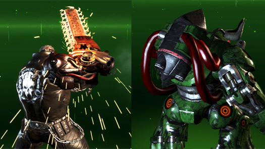 The back tells it all.
And characters who had originally appeared in Madworld, like Jack with his chainsaw, or Baron and his… pimp fashion… were carefully redesigned to keep the feel of the old character while adding a new image.
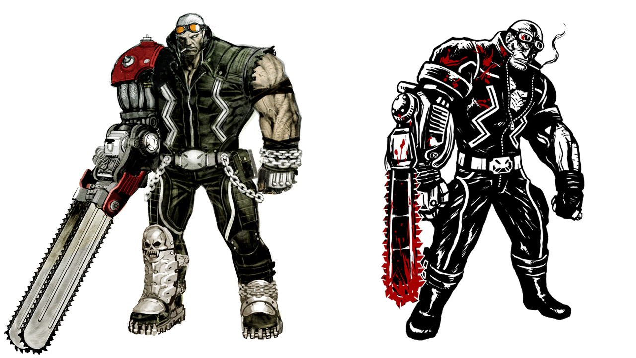 Left: Jack from Anarchy Reigns. Right: Madworld’s Jack.
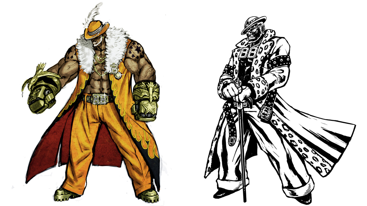 Left: Anarchy Reigns’ Blacker Baron. Right: Madworld’s Blacker Baron.
As this game features a large cast, all with pretty crazy, usually massive killer weapons, I didn’t have nearly enough time to detail characters as much as I wanted. The modeling staff really saved me by fleshing out the characters with the limited number of drawings I provided. You can check out what we think goes into making a character in the character viewer. (Like the panties? I made them.)
Let’s briefly touch on each character.
Jack:
The first character I designed. There wasn’t a modeler on our team at the time so I took care of the modeling as well. I designed him while modeling how he’d rip out his chainsaw. The mechanical part of his arm was designed to be similar to a motorcycle engine, just like in Madworld.
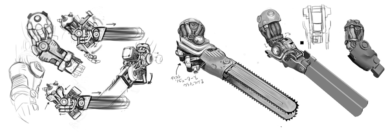 Designing how Jack takes out his Gator Tooth.
Baron:
I really like the fire design you can see on his head when he takes of his hat. In Madworld, it was lightning.
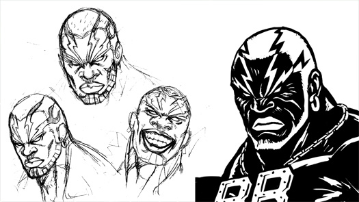 Left: Baron’s head this time. Right: Baron’s head from Madworld.
Mathilda:
Thorn nipples. You think Mathilda, you think thorn nipples, which is a good thing. I wanted her to be a sexy android. (like this)
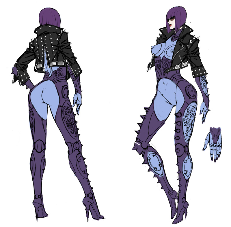 Mathilda, one step before the final design.
Leo:
He was designed with a bike motif to go along with Jack.
The way his suit changes for his killer weapon took some intricate design, and I think it looks pretty damn good.
We were thinking about making him a mutant at first, so he’s come a long way.
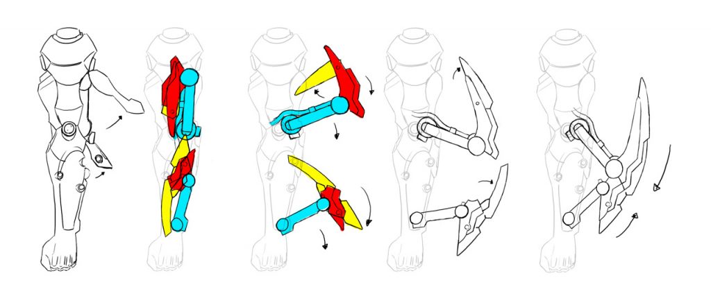 The inner workings of the Positron Blade.
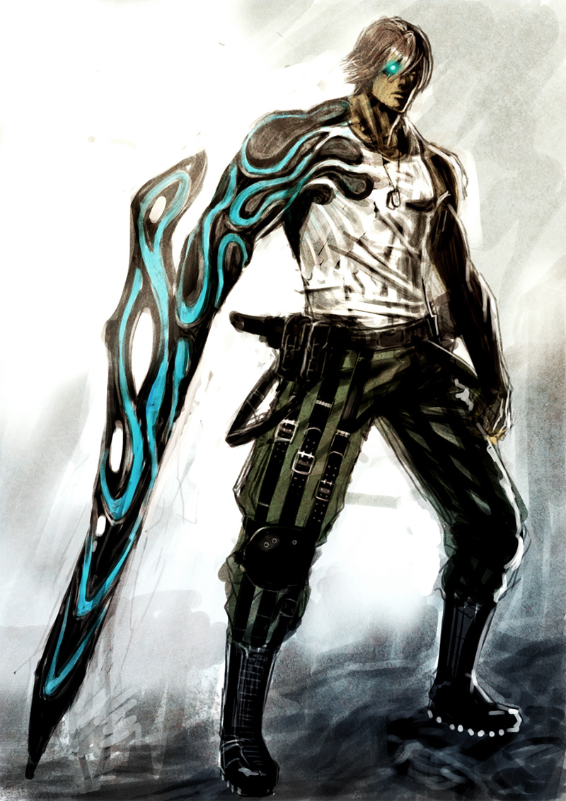 Leo, when we were still thinking of making him a mutant.
Sasha:
Lots of hexagons to give the feeling of ice. At first we wanted her to be Snow White and each piece of her killer weapon had a name of one of the seven dwarves. Including the big piece in the middle, there were seven pieces in all.
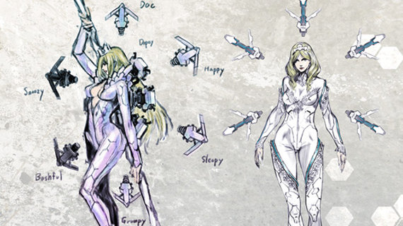 Sasha, in the early stages.
Nikolai:
His design branched from the nuclear mark on his chest.
Bull:
His design was accepted relatively quickly. The director, Yamanaka, came up with the idea to make his midsection look like a bull’s face when charging.
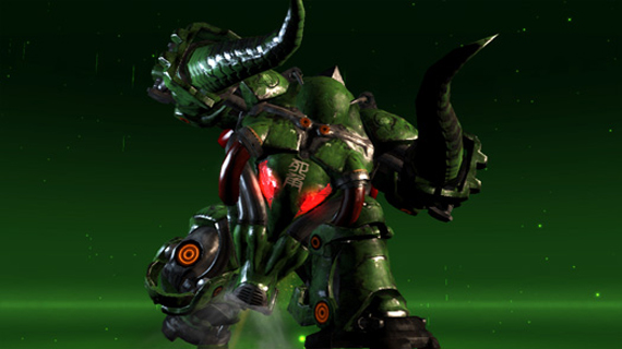 Bull charging.
Zero:
I was told he needed to have normal katanas: no tricks or anything. Which stumped me for awhile, but ultimately I came up with having the trick be in his sheathes instead. The circles on his chest are relics of his family crest.
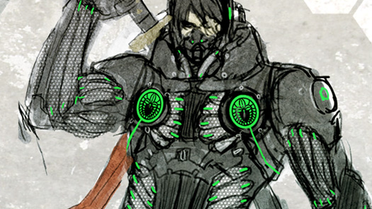 Early design of Zero with his family crest.
Durga:
Designed after panthers/tigers/other big felines. I was happy to be able to make an old guy with a tail. Personally, my favorite character.
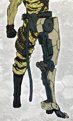 The tail is supposed to work as a balancer.
Garuda:
Kotegawa worked on the modeling while I simultaneously did its design. Change it to white and some people may think it somewhat familiar…
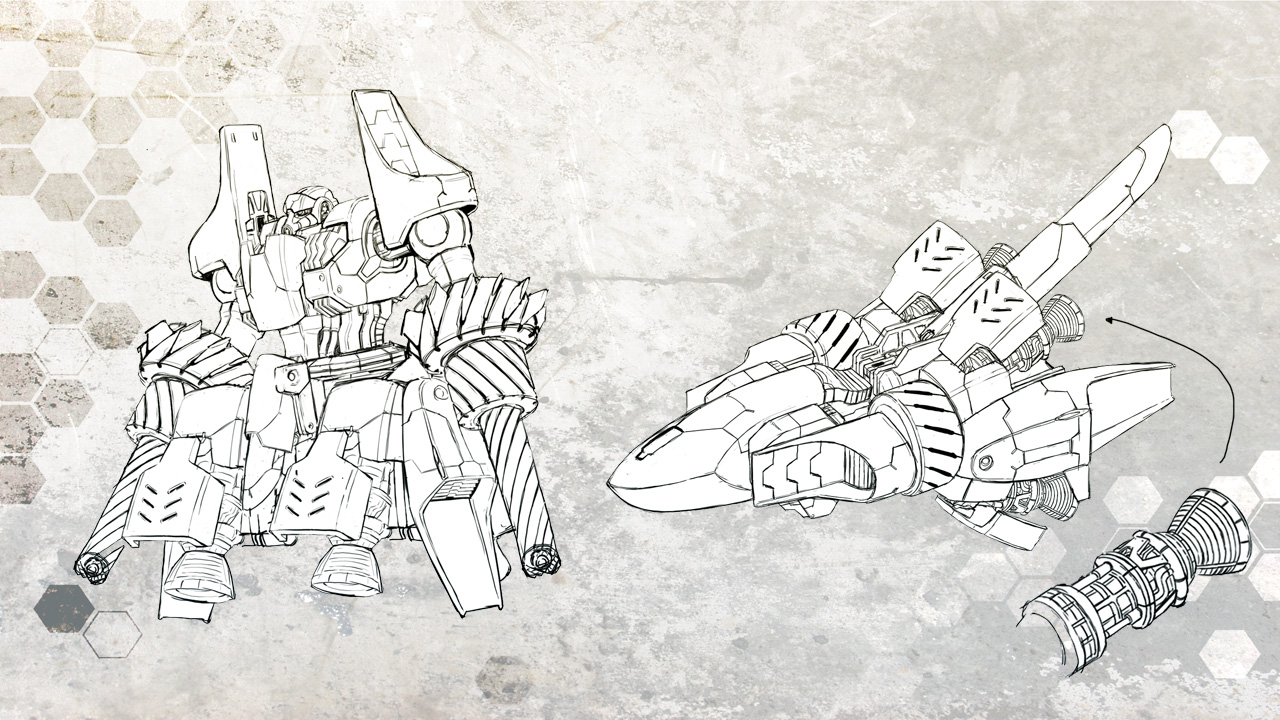 Garuda, before and after transformation.
Rin Rin:
Personally, I’m proud of how I could design her showing her underarm without showing her shoulders.
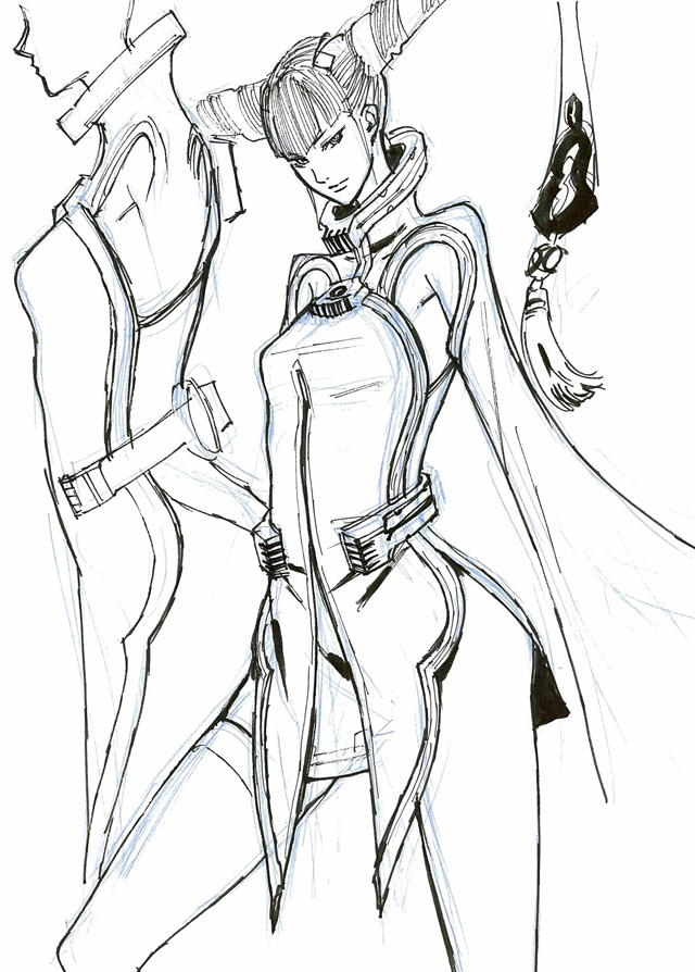 Rin Rin sketch.
Fei Rin:
Originally, she didn’t have any cleavage. Yamanaka told me to put some in. I’m glad he did.
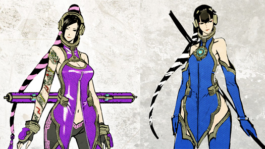 Left: Final vesion. Right: Original.
Ai Rin:
Since all three sisters share the same design base, I needed to make sure you could tell them apart in conversation scenes. I’d try changing their hair, eyepatches, headsets, and so on.
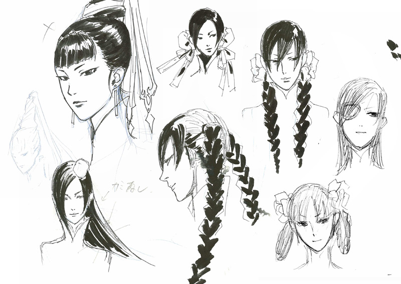
Drawing stage, trying to come up with some variation between the sisters.
Oinkie:
I started with a pretty serious design. Then I made his face look like it was covered in polka-dot underwear.
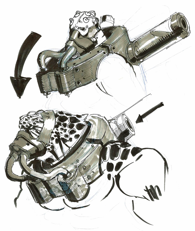 Back when Oinkie had a more humorless design.
Douglas:
A weathered soldier. Tried to include some elements of shining armor in the design.
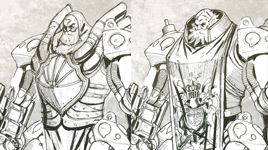 Early designs of Douglas.
Max:
His killer weapon takes a little from Sasha, Nikolai and Leo (it’s an electric blade with detachable parts). I like how we were able to model his face and do his expression.
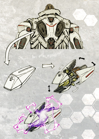 Max’s Killer Weapon
I could probably go on more and more about each character forever, but I won’t. Hope you can find one you that fits your brawling philosophy.
I’m not honestly the best at action games so take it easy on me if you ever come across me online.