The first concept we started out with from an art design standpoint was creating graphics that would reinforce that the player would not feel guilty for the brutal things that happen in the game, but instead would be able to have fun and laugh.
However, for me as a designer, my goal was to create art that would make you stop the page if you saw it in a magazine, or click a link if you saw it on the web. It was to make art that instantly caught your eye and stayed with you.
So the background artist and I secluded ourselves in a small room in the office. We initially had three ideas, and we approached them one by one.

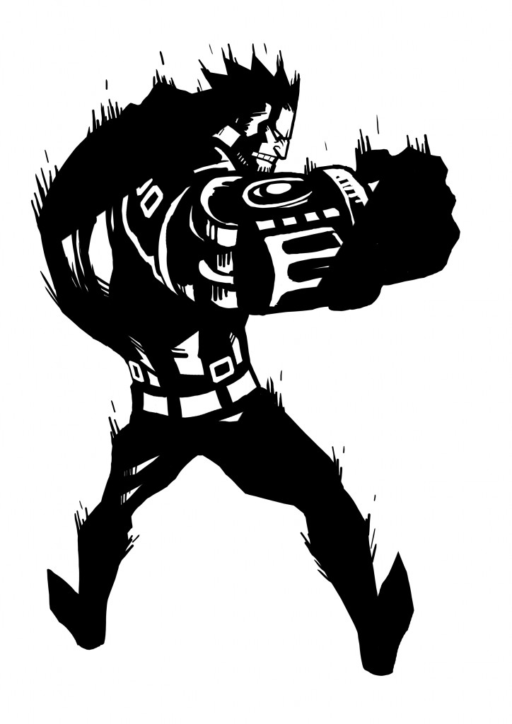
(An early Jack design.)
If you are trying to express brutality, completely realistic graphics would be visually stimulating. However, even if you succeed in going down the realism route, it will probably be lost in the shuffle of other games being announced at the same time for more powerful hardware. We thought that hardware specs cause very little variance in the kinds of things you can express with art, so we started our drawing with our goal being a hand-drawn comic book feel.
We worked on our first proposal for two weeks, when a programmer walked by and said, “This is great! It feels fresh! I’ve never seen a game like this!”
His words were enough to know that the first proposal, black & white, was what we should go with. Even though we didn’t explain a thing about the design, those words made us feel that we had gotten the feedback toward the art that we had been after. We didn’t really work on the other ideas much after that. Instead, we focused on furthering the black & white designs.

(The first black & white test.)
Once our design was set, we started implementing the black & white art into the game. We chased after that comic book feel that would become a signature of the game. Shadows, outlines, effects, textures… We decided that everything should be made two tone. It was based on a single key phrase- An artist could have sketched this.
No one had really seen black and white in a game before, let alone tried to play a game that way. I thought that someone must have thought of it somewhere, sometime, but there must be some kind of stumbling block that has prevented people from doing monochrome up until now. The truth is that there are many stumbling blocks. First, your eyes might get sore. Or you might not be able to figure out where the enemies are. Or you might not understand where the pathways are. Even if you progress through the stages, there won’t seem to be progression. Everything is hard to see pretty much sums it up.
There were times when I thought to myself, “Ahhh… I wish I could use some grey…”
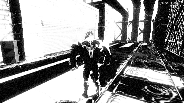
I even tried it in a few tests, but it just didn’t look good. It looked like just some picture that someone had drawn without color. It had completely lost the contrast and solidity you get from two-tone images. I rethought things, and realized that I had to put all my efforts into making black and white two-tone work. For instance, even though your human eyes see the two-tone as black and white because of the contrast, we actually put desaturated yellow into the game. We would also up the contrast on the far reaches of the background instead of obscuring them. We used lots of little tricks like this.

(Testing adding yellow.)
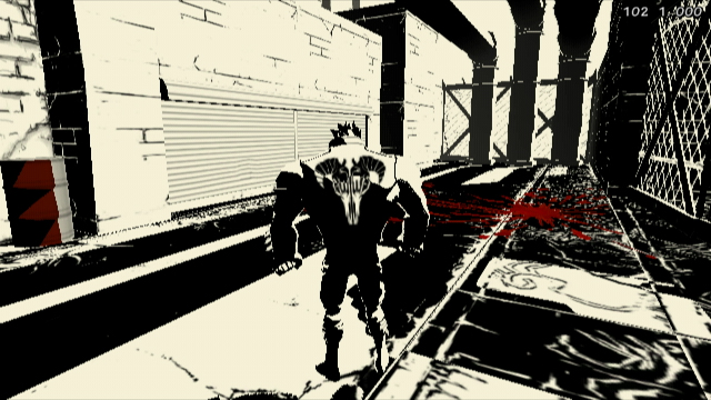
However, even with all the trial and error, it didn’t take a very long time to arrive at something that made me feel, “This is awesome!” I achieved what I was going for as a designer, and once we added the red blood to the black and white, and then added the comic book text sound effects, we achieved what we were going for from a game standpoint- brutal and fun.
Looking back, I am proud to say that we never strayed from our initial concept in making the graphics for MADWORLD. We hope you play our “playable comic” and love it as much as we do.
Masaki Yamanaka
Lead Character Designer & Art Director, MADWORLD

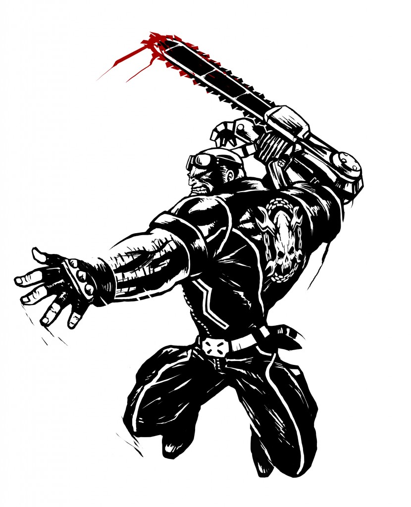
(The final Jack design.)