Nice to meet everyone. This is Fujii, in charge of GUI design.
As Anarchy Reigns is Platinum’s first game with online capability, I’d like to write focusing on what specific precautions this required with the game’s user interface.
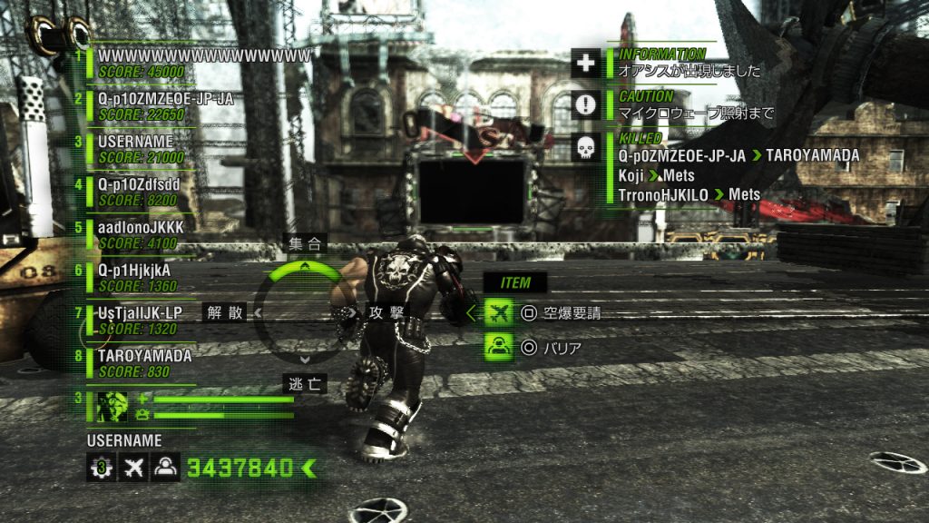
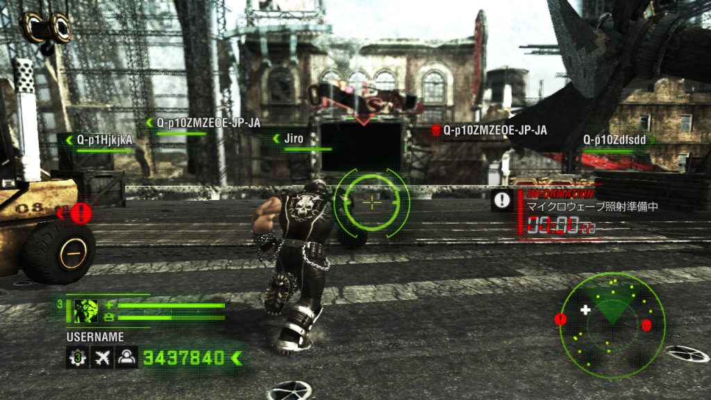
I started working on Anarchy Reigns about halfway into the project’s completion. By that time about half of the HUD (head-up display) data had been finished, but the game design team had needed to make it all separately, so it looked, and in reality was, all over the place.
Now, a little debriefing on this entry:
UI: User Interface. A system by which people interact with a machine. In relation to this post, UI refers to how the game displays information on the screen to communicate with the player (i.e., the health bar, radar, points)
GUI: Graphical User Interface. A type of user interface that uses pictures or symbols to communicate ideas directly and quickly. In video games, players are often required to react spontaneously, making a GUI that can convey data fast (while not interrupting the game’s feel) crucial.
HUD: Head-up Display. A type of user interface that displays information on screen, overlapping with the player’s perspective, rather than on a separate menu or screen. Like writing scenery description on the window you’re looking through, HUD is direct and easy to understand. HUD works well in games as it allows the player to focus on the game without visiting menus.
Let’s bring this back to Anarchy Reigns. What I worked on, was:
-organizing how things looked
-organizing scattered data
First, concerning how the HUD looked: “gritty, husky scifi” had been part of the game’s concept from the beginning, so I tried to lead design in that direction.


Then, I set out to create an HUD image board that could display a lot of information simultaneously on a standard definition TV.
Each GUI designer inputs their gameplay data into this image board. This helps people have a concrete design image to work with as they develop the game: without it, countless spontaneous decisions followed by countless corrections are necessary, and you end up with a cluttered, confused game. Having a clear set of rules enables designers to react to every addition or revision with little difficulty.
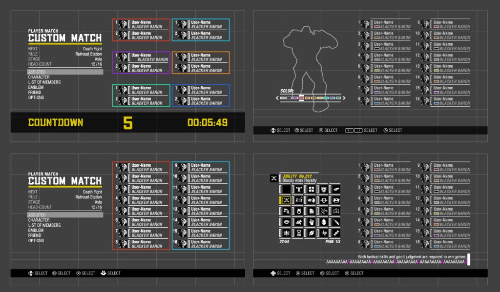
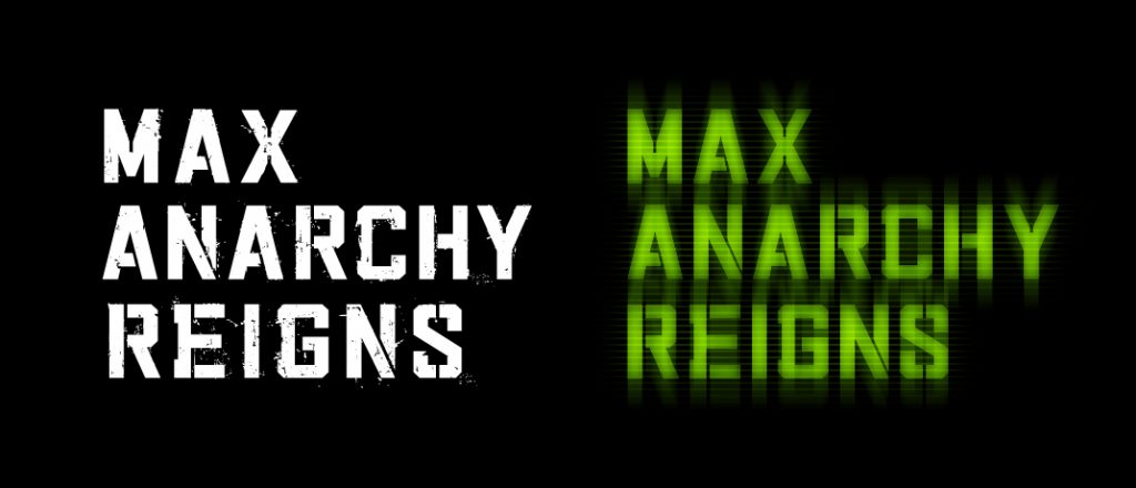
Next we worked on organizing large quantities of information on menu screens outside the HUD. We made an original font to go with this: something a little more rough around the edges and stiff than Vanquish (a previous title of PG) and easy to read even when displayed in large letters. The new font’s name was “Vanquish Military”, which we later divided into different versions: one for when dealing damage, one that lights up, etc.


As an online game, Anarchy Reigns includes a sizeable amount of UI data, but each GUI designer worked on letting the player focus on gameplay as much as possible. We hope that you can absorb yourself in the game without even noticing the UI. That would be how we’d feel we’d done good work.