PG game designer Takahisa Taura here. It was my pleasure to share some new information and footage from NieR:Automata at E3 2016! Today I’d like to go a step further and give you an up-close look into our development processes, and share some of the challenges that the team and I have faced on this project. We hope you enjoy this taste of what it’s like on our side of the screen.
Game Design – Takahisa Taura
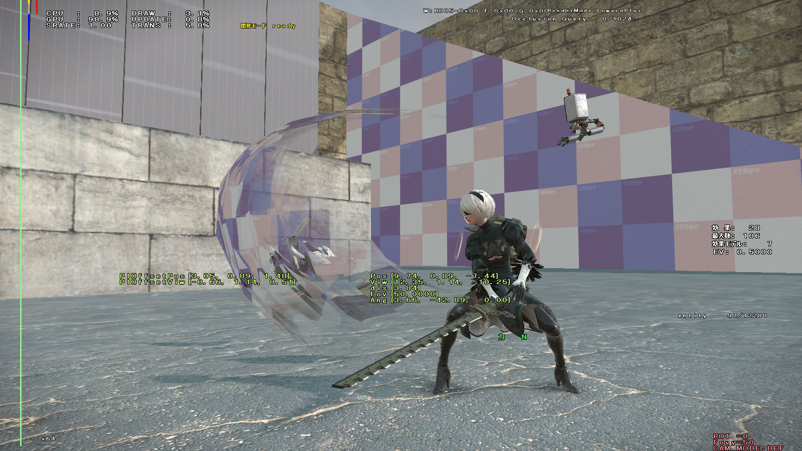
What you see here is a test level where we check characters’ animations to make sure they’re ready to go in the game. We also use this level to try out visual effects, like the sword arc you can see above, as well as special effects like clouds of dust, explosions and more.
In an action game, the response time between when a player pushes a button and when their attack is performed has to feel great. To improve this response time, we use a special tool to fine-tune when each animation can be canceled into other actions, and occasionally even make subtle adjustments to their total speed. We have to be careful, though – if the animators catch us changing the speed too much, they get pretty mad…
After a bit of tweaking, we try it out and see how it feels. Then we tweak again, and test again, then tweak again, then… It’s repetitive work, but all this testing is essential to make NieR:Automata feel exactly as it should. Sometimes we end up spending an entire day just working out the perfect way to position enemies in a single fight scene!
It’s absolutely critical to start with a solid premise, then playtest again and again to make sure you’re staying on track. Passersby usually assume we’re just playing games all day, never suspecting how much blood, sweat and tears it takes…
Now I’d like to hand the post off to some other members of the PlatinumGames NieR:Automata team!
Animation – Takayuki Muranaka
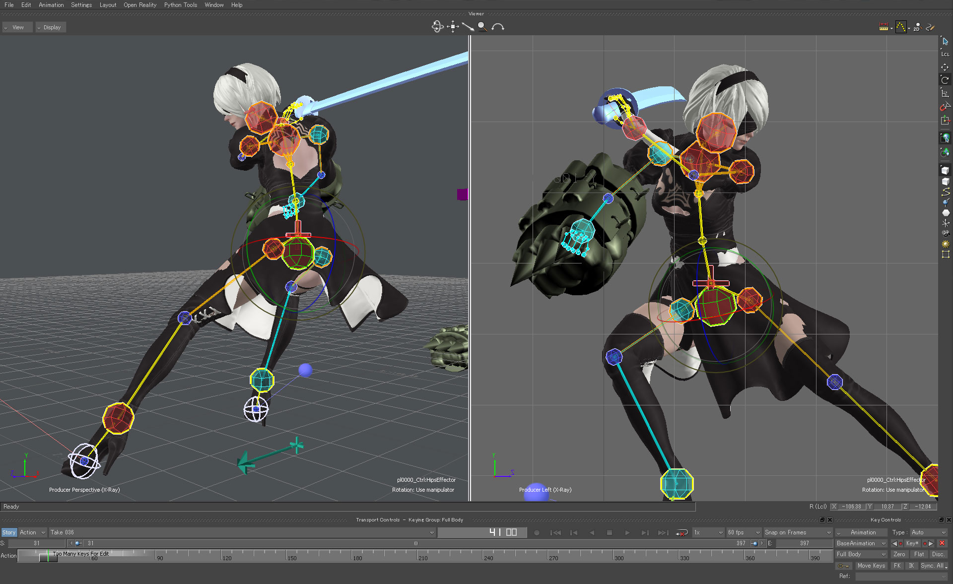
Here you can see an attack animation for 2B in progress. In this attack, she uses both her sword and that large melee weapon on her right hand. 2B has a sense of elegance that we try to capture in all of her animations. It’s not enough for main characters’ animations to just look good – they have to feel good in players’ hands, too.
Here’s a common situation: You’re patting yourself on the back for making an animation that looks super-cool and flows really nicely. Then, you put your perfect animation into the game engine and try controlling it, and it dawns on you that it’s too slow, too clunky. With tears in your eyes, you go back and cut away huge parts of your magnificent creation until it finally feels good.
As an animator first and foremost, there’s a lot you can’t help but want to leave in. But you’re not making a movie here – you’re making a game, and it has to be tight and responsive. The truest sign of a skilled game animator is their ability to make something great with the number of frames they’re given.
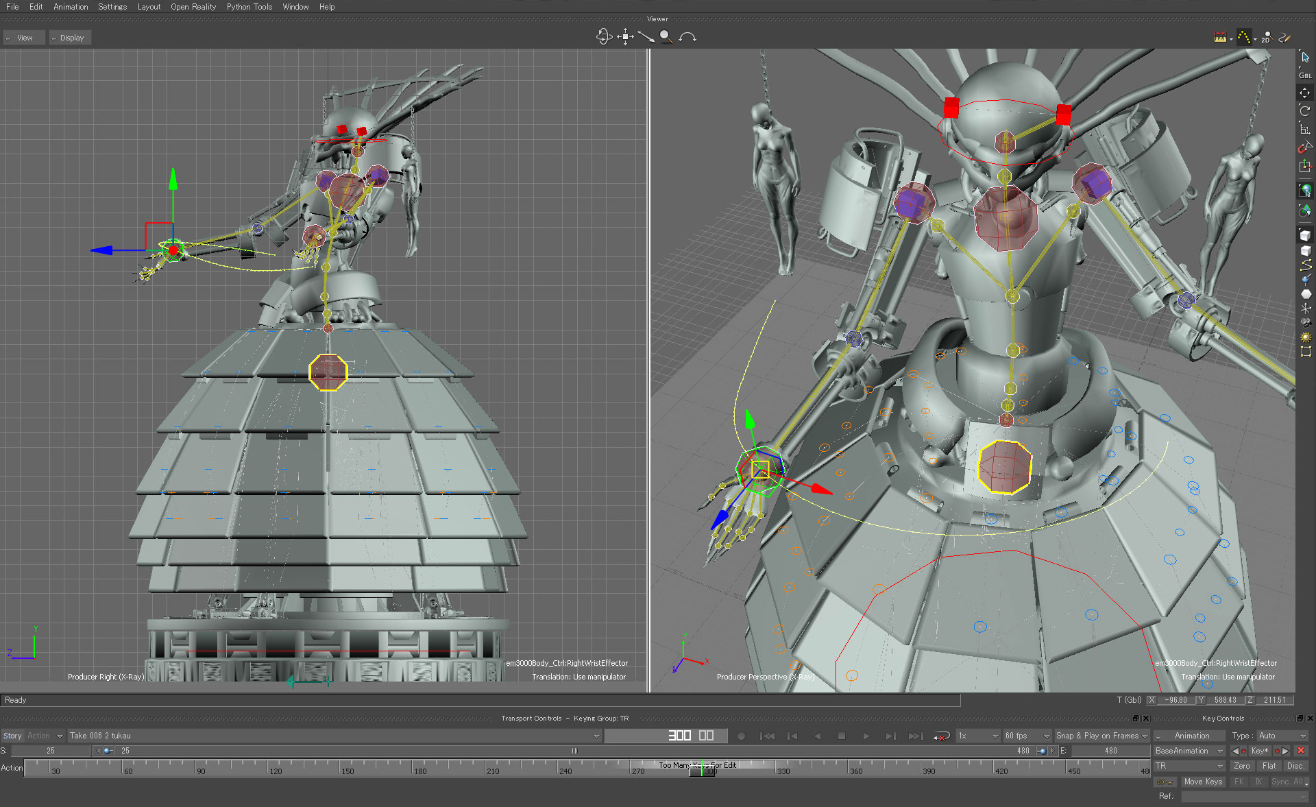
Here we’re working on an animation for the boss robot you saw in the E3 2016 trailer. This boss came with some special directions from the designer in charge of mechanical characters: She has a lot of joints that can only bend back and forth in one direction, giving her believably robotic movements. For example, in her shoulders alone there’s a detailed division between parts that can only turn one way, and parts that can only turn the other way. This robotic joint structure applies to this character’s entire model, as well as other robots in NieR: Automata.
As a result, the controllers that drive this boss’s animations are quite a bit more complex than they appear at first glance.
Character Modeling – Kazunori Tazaki
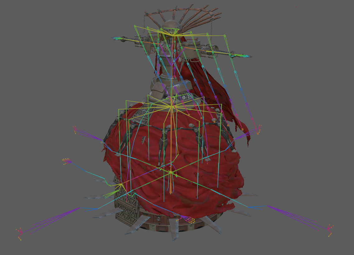
Character models are animated through a system of joints that we call “bones.” Each of these colorful lines is one of the boss’s bones. She has 364 bones in total – 249 in her body, plus another 115 in cloth details like her cape and dress. The metal skirt that makes up her lower body is collapsed in this view, so it’s covered by her cloth dress
The trickiest part is properly controlling the movement of her cloth details. Robots tend to look bland and lifeless when they aren’t moving, so making her cape flow in a somewhat exaggerated, almost heroic manner helps her look more dynamic. It was harder than we expected to keep her metal skirt from sticking out from under the cloth dress when she moves! The more we tried to fix it, the more her dress stretched out to its limits. It took a lot of time and effort to keep her dress shaped properly.
Enemy Concept Art – Hisayoshi Kijima
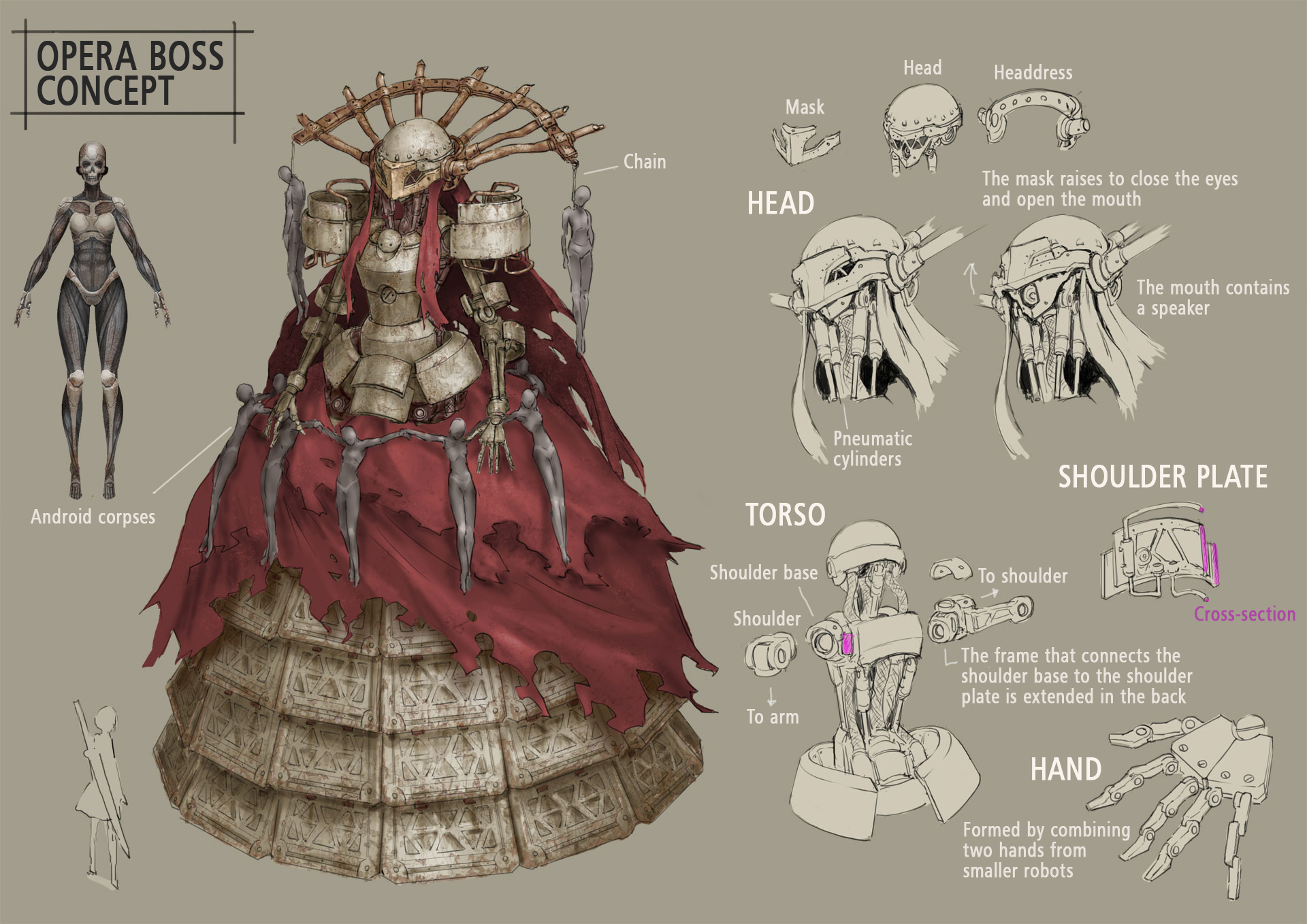
It took three different designers to arrive at the character you see now: One made the original concept, another made the full rough design, and a third (that’s me!) added all the additional details. I also worked on the designs for the other machine lifeforms you’ll find in NieR:Automata, making sure they have an appropriate amount of visual detail. I also check over all these designs with an eye towards what configurations and mechanical details would make for the best possible 3D character models.
Like all the machine lifeforms in NieR:Automata, this character is made of rough, raw metal. Keeping her consistent with similar characters while also giving her a uniquely feminine atmosphere was pretty tough!
Environmental Concept Art – Kazuma Koda
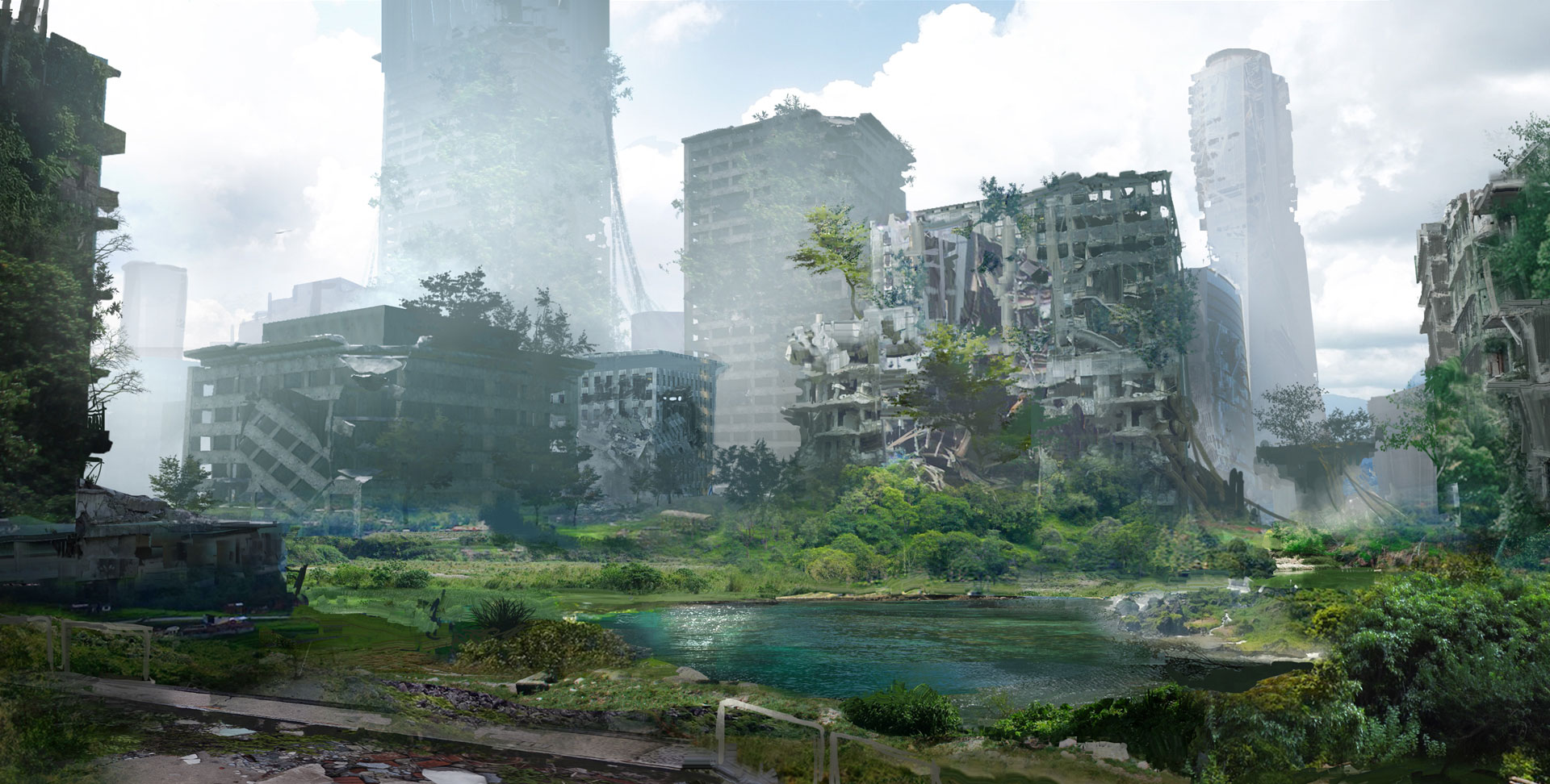
I made this concept art of an abandoned city by painting over a screenshot of the area as it looked in the unfinished game. Environmental concept art like this serves as a solid guideline for the team that makes all the environmental models. I originally painted this cityscape with much darker colors – though the weather was always pretty nice! In the end, I decided that it didn’t match the overall feeling of NieR:Automata very well, so I brightened it up to what you see here.
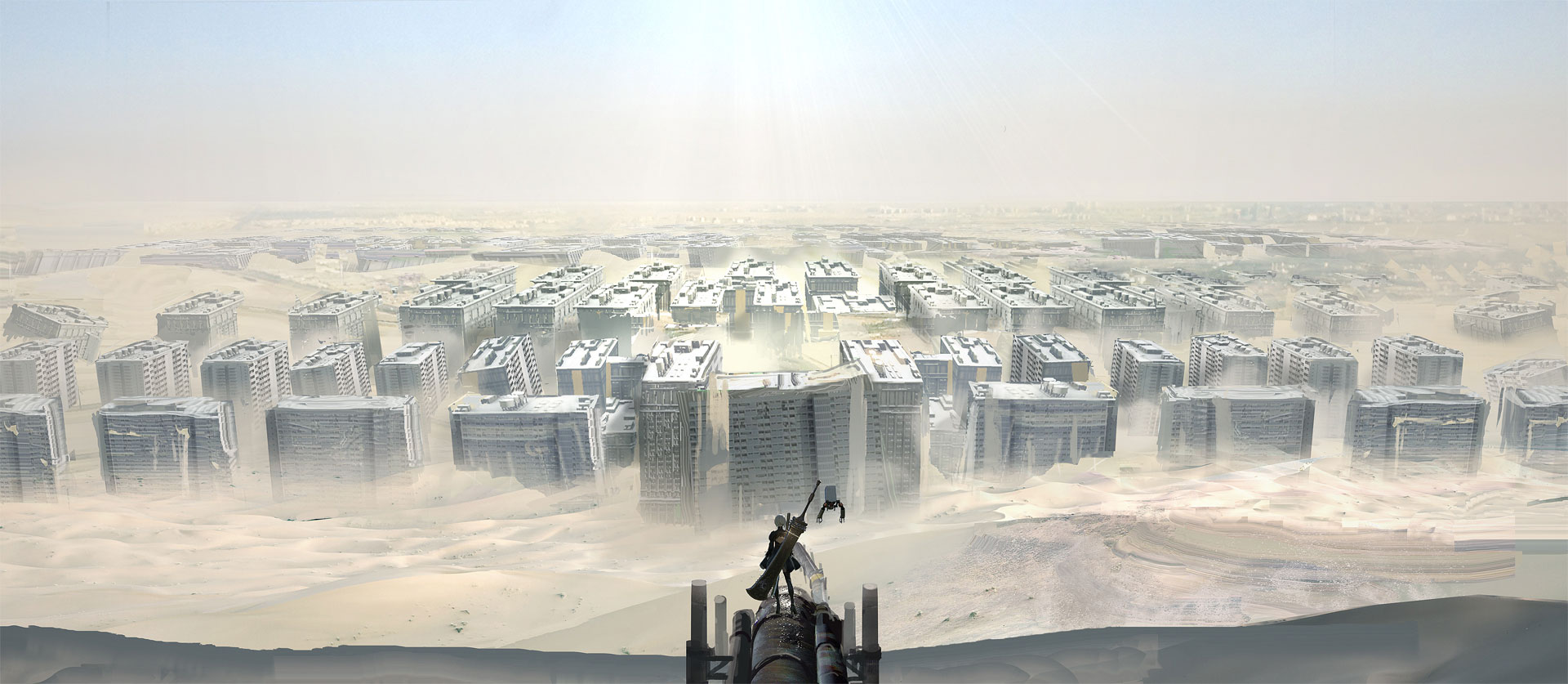
Here’s a distinctive landscape! Rows and rows of nearly identical housing units stretch across the desert as far as the eye can see. To be honest, I’m not crazy about having to draw the same thing out over and over again like this in 2D, so I started making this piece by digitally placing models of the buildings in 3D space and painting over that. To keep it consistent with the overall game world, I brightened the scene up and toned the colors way down until it’s nearly monochromatic.
Sound Design – Misaki Shindo
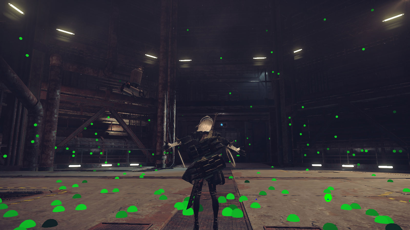
In a tight, closed space, sounds don’t echo very much. In a wide open room like the one above, though, echoes last longer. Echoes also change depending on the materials that make up an area: They’re louder when you’re surrounded by metal than when you’re surrounded by dirt, for example. Each area you explore in a game needs its own reverb settings to get these echoes just right.
In all our previous projects, we sound designers made individual settings for echoes to fit the exact shape of each area in the game. However, since NieR:Automata takes place in a more open world, it would take a massive amount of work to do it that way. We’re aiming to cut down on all that effort while creating a realistic soundscape for the game by using a system that can manage echoes on the fly.
This system sends signals out into the area around the player, and these signals provide information that helps determine how much reverb to use – what the walls are made of, how big the room is, and so on. The green dots in this image are the exact spots where these signals hit, but you won’t see them when you play NieR:Automata. They’re just there to help us debug the dynamic echo system!
(This post originally appeared in Japanese at Square Enix’s official NieR: Automata blog.)