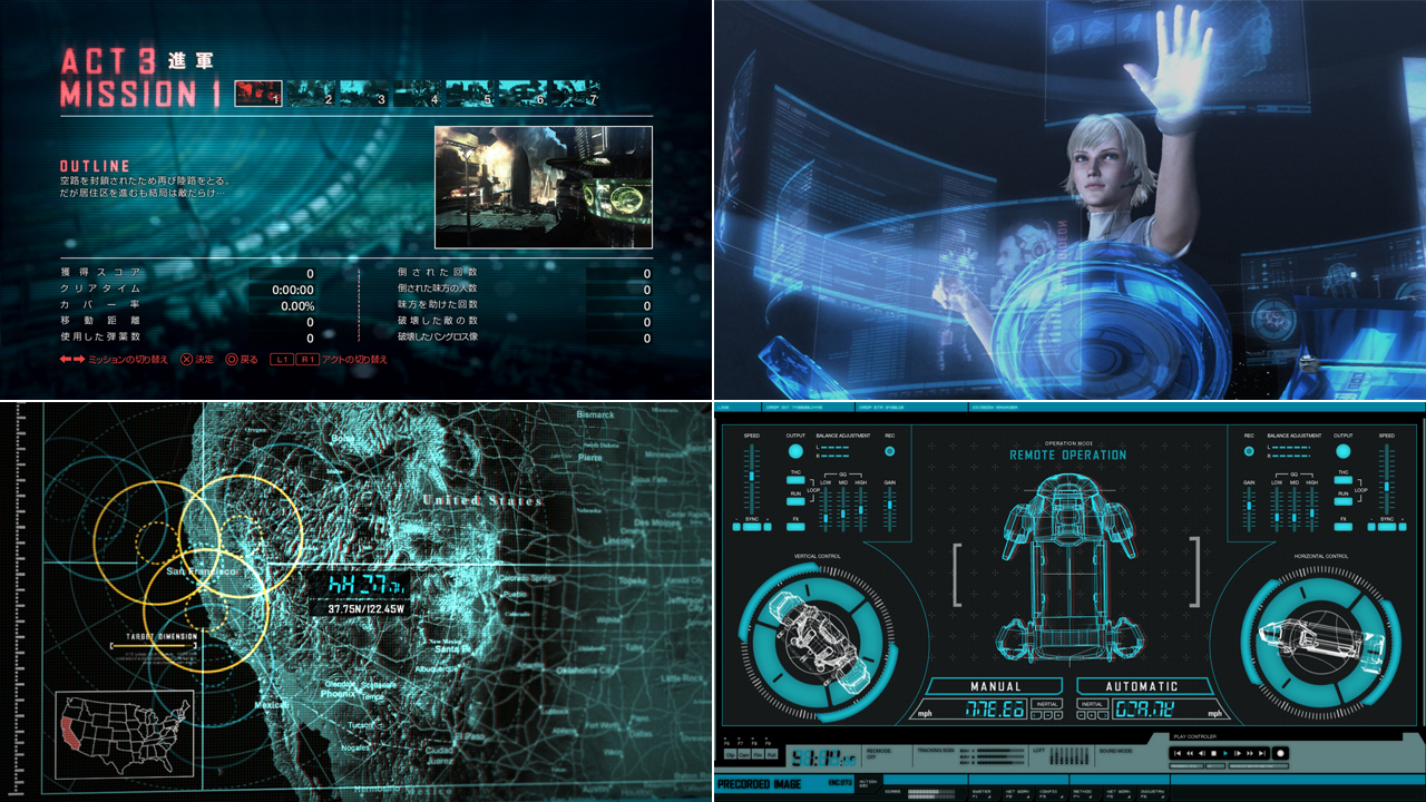
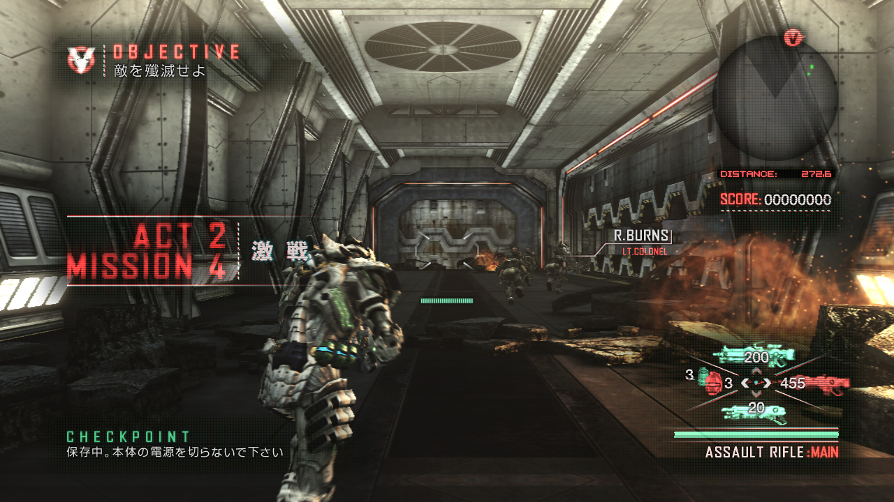
Hello, everyone! I’m Takahiro Fujii, and I am the designer for the graphical user interface (GUI) in Vanquish. The GUI is in this game spans everything from all of the menus, to the heads up display, to the interfaces that Elena uses in the cut-scenes of the game.

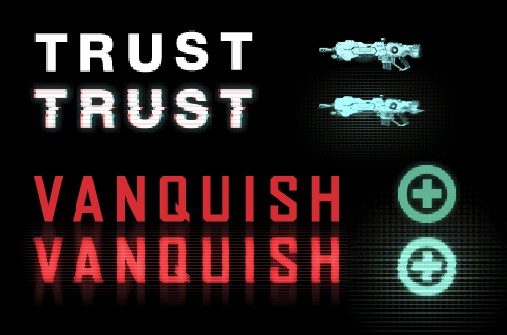
Vanquish’s GUI was made at 1280 x 720 pixel resolution. Working at HD resolutions is really a godsend for a designer, because things with high contrast, like text/symbols, can be clearly defined; however, there is a downside to the benefit of having such clearly defined outline around images and that is getting into a situation where the image starts looking bland. I wanted to do something to make sure this didn’t happen in Vanquish, so I made sure to include elements like dirt and distortion, noise, and an abundance of optical effects to make the interface seem a bit blurred and out-of-focus.

While blurring elements meant complicating some of the information displayed, when it came to the size and layout of the HUD, Mikami-san dictated that we needed to take into consideration how much we were throwing up on the screen and how fast the action was moving, as he wanted the player to be able to focus on the gameplay in the game. This led to an extremely functional design.

If you don’t pay attention, you probably won’t be able to tell the difference, as it really isn’t a flashy effect, but the change between putting effects on the interface and leaving things plain is really night and day. I plowed through my work with that belief in mind. Of course, when everyone is playing Vanquish, I don’t want you to even think about what I’ve written about here, and just enjoy the experience. As a creator, that would make me happier than anything.