Hi everyone! I’m Yama-chan, a game designer here.
I was told to write about blog about the game design elements of Bayonetta, so here we go…
Even after we finished work, time passed as I got caught up in anticipation of this and that, but somehow, once I finish something, it seems like I have a disposition to forget what I’ve done. This time is no exception, and I feel my recollections may be rather dim…
That’s why I reintroduced myself to some of the old documents and such that I made. While I was looking at them, I would see things that would make me say, “Oh yeah, we had this!!” So I thought that I’d regret… I mean release these things and everyone could experience some of the trial and error that we went through at the beginning of Bayonetta.
The area around Vigrid Station is 50% larger than the original
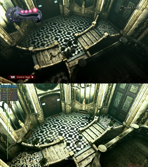
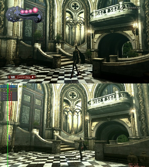
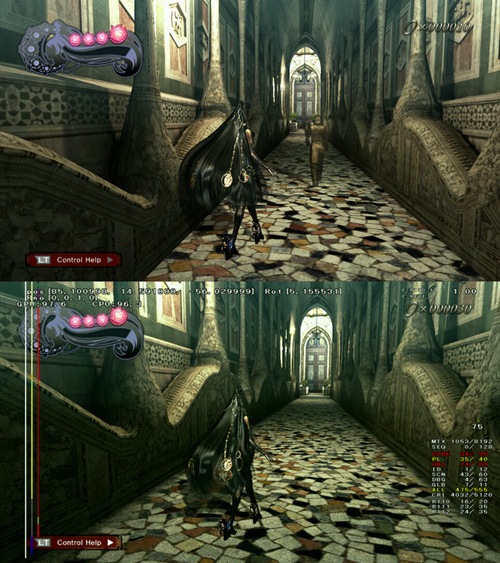
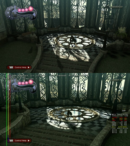
The image above is the original size, and below is the same size as the shipping version, or 50% bigger than the upper image. The health bar is also an old version. At the beginning we decided that we wanted to make things real, which guided our decision making on size, but Bayonetta’s actions were much larger than we imagined, and that plan flew right out the window. Thus, we made the change towards bigger areas. Another reason was because we needed extra distance to compensate for Bayonetta’s fast movement and allow us time to load the stages into memory. The image quality differences are due to the implementation of graphical filters.
The Witch Time statues were originally Crystal Skulls
We had planned to let players carry the skull around like a normal weapon, and by pressing Punch and Kick simultaneously, Bayonetta would throw the skull to the ground and activate Witch Time.
We planned to allow Witch Walk in all areas of the game, instead of just limiting it to selected areas
Here is a peek at some of the Japanese design documents from Chapter 2.
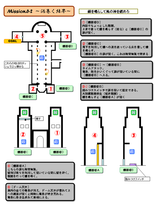
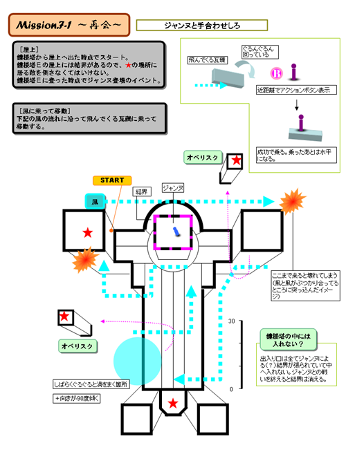
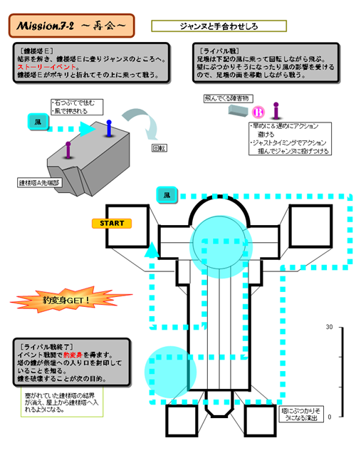
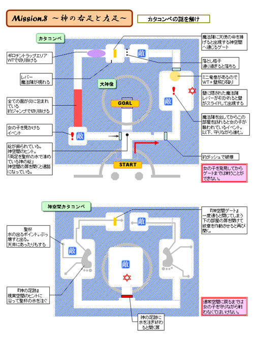
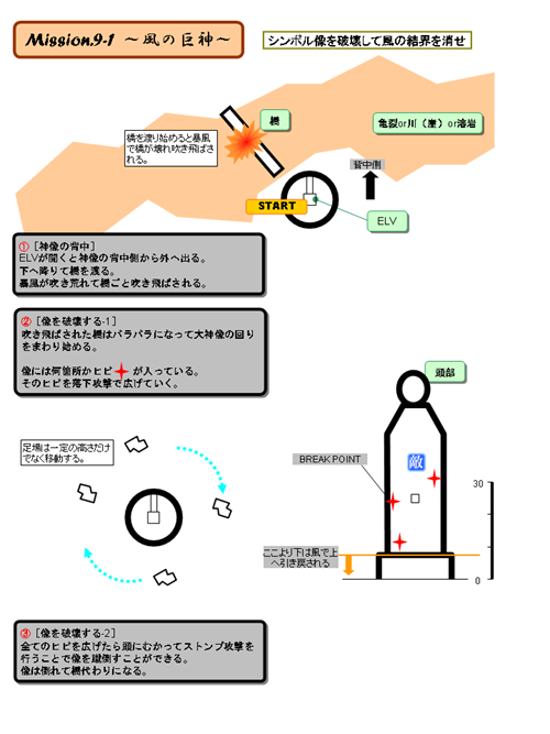
The pages above are just pages 6 to 10 pulled from a 13 page design document. Unfortunately, I’m not able to share the full document for some “grown-up” reasons. The historic ruins of the Witch and Sage that appear in the full game was originally a church, and we had planned a stage around it where the player would use Witch Walk to move around the walls and proceed through the level. It was a stage with quite a few puzzles. Whenever we would try to include Witch Walk as a normal mechanic, things would almost certainly head for puzzle-laden territory, effectively bringing down the tempo of the game, or causing other side-effects like filling areas that have no connection to the action with Witch Walk. We kept getting further and further away from our original concept, so we decided to limit Witch Walk to specific situations. I think that Witch Walk, as a gameplay mechanic, would probably best be tried in a slower-paced 3D puzzle game. Oh, I forgot to mention that Shibata-san was in charge of the final Wind (Ancient Ruins) stage. I was in charge of the tutorial, and the opening of the game up until Fortitudo. I also had a hand in an area towards the end, but I can’t share much about it right now because it would be a spoiler.
The Torture Attacks originally went by names like Boredom Breaker, or the Fallen Angel Buster
What can I say, we were all raised on Kinnikuman.
The Witch Hearts were once Blue Orbs
Item names are, surprisingly, pretty all over the place until the very end of production. In-production enemy names usually end up being based on how they look or how we imagine them to be from their concepts, as during development enemies tend to change appearance and the like. When Don-san was writing his blog, he said something along the lines of “I don’t really know the enemy names.” Well, the truth is, I don’t know them either. (Yikes!)
Other than that, we even had ideas for an overworld map at the beginning of the game… But to share it now would definitely be a spoiler, so I will hold off. If they ever put out a Making-Of book, hopefully I will be able to share it with you all then.
I also wanted to share with you some full email conversations with myself and Kamiya-san that we shared while he was on a business trip overseas, but they all got cut out because they said that I was “going too far!” I guess there is such a thing as too long a blog…
So what do you think?
There are lots of ideas that are born and die over the course of a game development cycle, and some of these dead ideas had more significance than others. Spirits also rise and fall. Game development is filled with drama.
Hardware changes and so do the player bases… I suppose you could call it the passage of time. Game design is not just a simple issue of trial and error until you find something fun, as you get wrapped up in not only things like changes in hardware and players, but the many other tasks forced upon you that don’t have anything to do with finding fun. These are both production challenges as well as mental challenges…
But I think we got to this point by always going back to the starting point of “I want to make a fun game!” whenever we hit a wall and questioned whether we could honestly pull this off.
I don’t think that PlatinumGames will change it’s core principle – that of making fun games.
So did you enjoy Bayonetta? I hope you find it fun.
Until next time!