Hello. I’m Okura, a designer here at PlatinumGames, and the oft target of Kamiya-san’s claims that I am the “gulliblest” of the absent-mindedly gullible. Of course, I think that he just doesn’t get it.
I was in charge of user interface design (UI) for Bayonetta. I’ve been in the games industry less than 3 years, so I am still a bit wet behind the ears, but I’d still like to tell you a little about the UI design in Bayonetta.
But before that, Bayonetta came out here in Japan a couple of weeks ago, and I assume that some of you have played it, but have no idea what actually comprises the UI in the game. Allow me to explain:
An interface is something that intermediates the exchange of information between two things and a standard for completing that transaction.
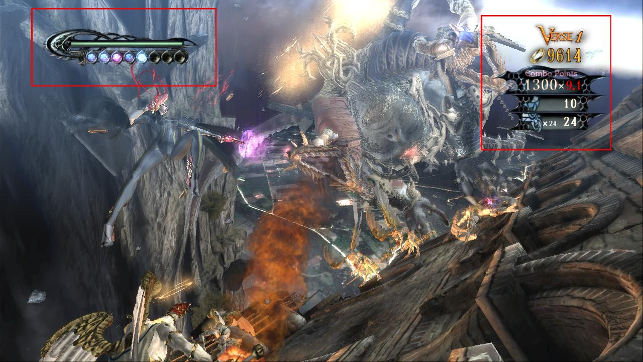
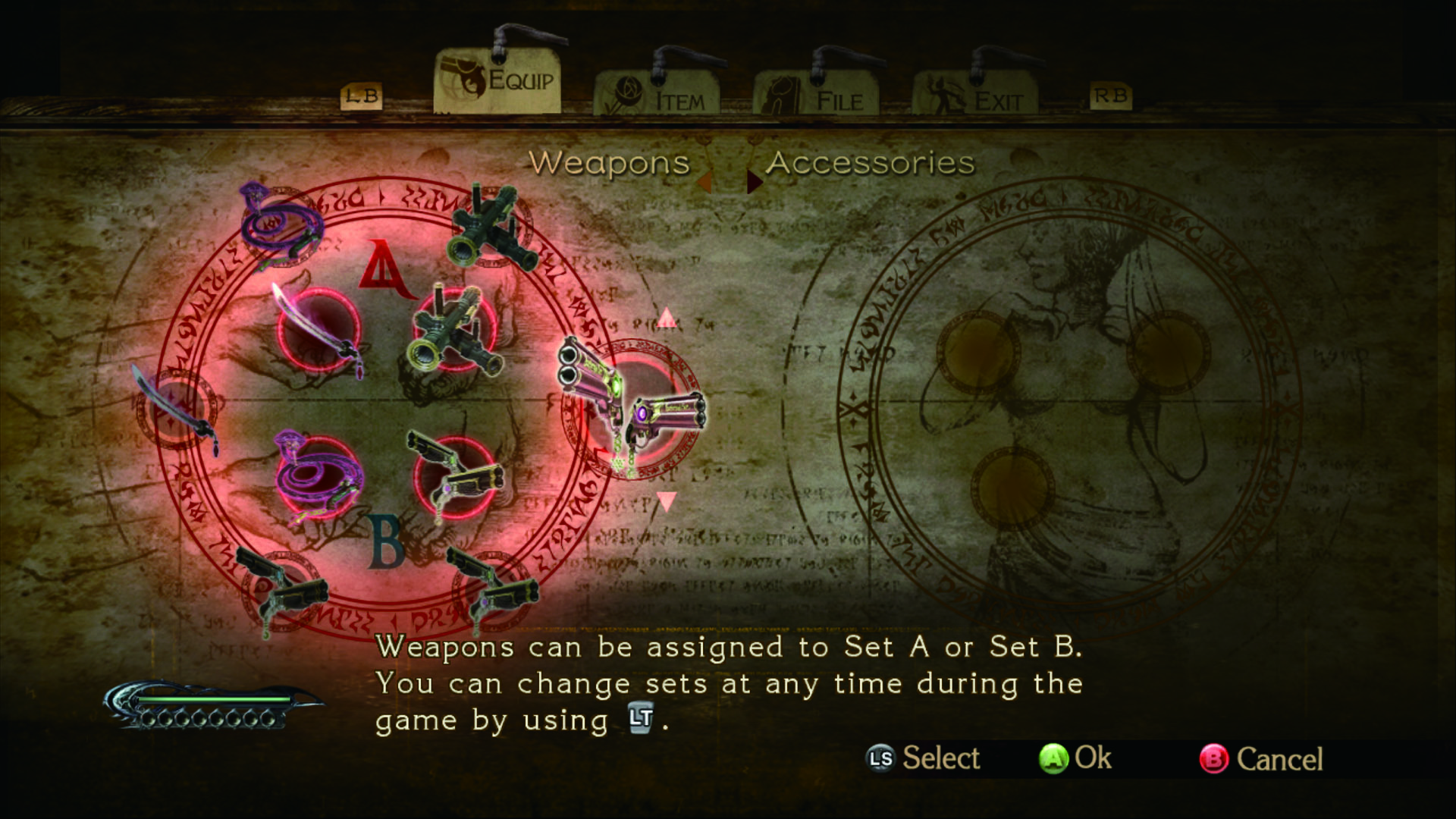
To put it broadly, the user interface tells the player information or provides feedback on the game system. For instance, gauges or menus that appear in the game. In fact, most of the 2D elements on the game screen are UI. When the names are displayed for the angelic enemies in Bayonetta, or when you obtain an item and a window opens, the ending credits, displaying how long it took to complete the game, the title screen, etc…


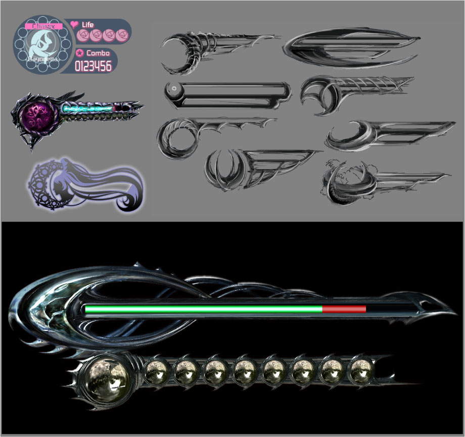
When creating Bayonetta’s UI, I was particularly careful to express the magical elements as well as the sense of exhilaration that you get from the battles in the game. There were actually six complete changes of the interface from when I started work at the beginning of the game until completion of the final product. I would crash and build, crash and build over and over again until I finally arrived at the design you see now.

As a rookie on the team, I felt on the verge of being swallowed up by all the UI work that had to be done, probably due to my inexperience and the sheer amount of small details that had to be created. But I have the sneaking suspicion that the one responsible for increasing my work load is none other than me…
As I talked with Kamiya-san during the process, so many things got added from what we were originally planning for at the start of the project.
“Hey, I was just thinking about something. What if we did something like this?” Kamiya-san would ask.
“That’s pretty cool. So it would be something like this…” I would reply.
“Ahh… That’s good. Make that.”
And then I would head back to my desk thinking, “Hmph… I shouldn’t have said anything. It’s going to be another late night…”
I had regrets like that one almost up until our deadline.
The higher ups would also get mad at me, and I would get lectured by my producer, Hashimoto-san, and I almost went ahead and rung my own neck; however, I was able to get all of our ideas into the UI in the nick of time, so there are no regrets to be had now! (Actually, I’m aware that just barely making it wasn’t the best thing to do. Sorry. I won’t let it happen again.)
Also, the UI elements that I worked so hard to incorporate are the sort of things that you won’t notice unless you are really carefully looking for them. Yet, for me, a good UI should be “subtle and smooth,” letting people to be able to enjoy the game. I think the best thing is for users to be able to “play without noticing,” so even if you don’t realize the things we are doing, if you are able to enjoy the game without having to take special notice of the UI, I feel that I have done a good job.
I’m sure there are some places that are lacking; however, for everyone who bought the game and played it, I would be happy if you could just enjoy yourselves without even noticing the user interface.