Hello again, everyone. Mari Shimazaki here, back to talk a little bit more about the character design on Bayonetta.
Thank you all so much for the comments on the blog!
Your comments are the source of much happiness here, so everyone on the staff makes sure to read them.
Well, E3 is now over, and I think everyone has finally seen videos of Bayonetta being played. I hope you are looking forward to the game even more now…
Since this is my second blog post on character design, I thought I would write about Bayonetta’s fateful rival, Jeanne.
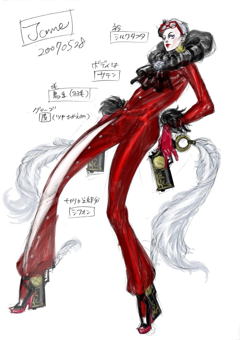
I think the only thing that could rival a woman is another woman, which is why we decided early on that Bayonetta’s rival would be female.
I thought about what we could do to make her the antithesis of Bayonetta… With Bayonetta, she carried strongly held, specific design cues such as witches being black with long hair. However, with Jeanne, I was able to freely deviate from those cues despite the fact she is a witch. Bayonetta is known for her long hair, so I felt that Jeanne needed to have some kind of defining trait as well. It became her large lapel. It kinda looks like Pon De Lion, don’t you think? LOL (Note: Pon De Lion is a popular character in Japan.)
Thematically, Bayonetta’s color is black, so to provide symmetry, Jeanne’s color is red. I added the slit-esque accents down the legs of her dress to allow users to easily see her action-game-style movements. The coloring on Jeanne was actually a result of me paying attention to another character’s design. It’s subtle… But maybe you can figure it out? You have to admit, the nice blend of red, black, and silver is cool, right?
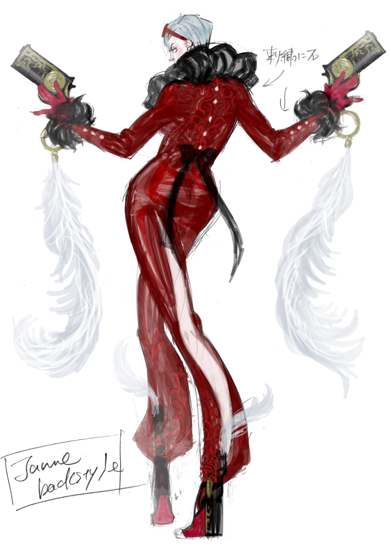
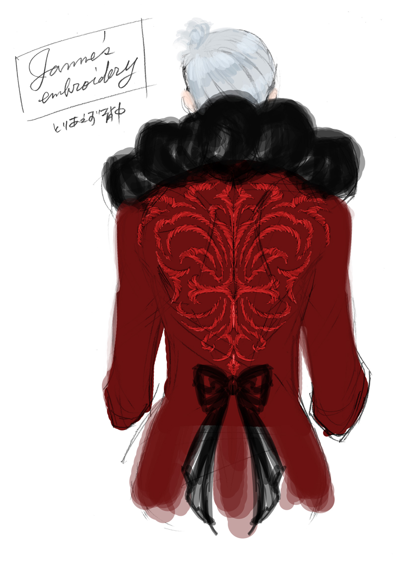
I also added some faint embroidery on her back.
From a game character design standpoint, having something that really stands out is what you would usually go with; however, we are intentionally avoiding that on this game. All of the characters in Bayonetta share a theme of being “fashionable,” so we try to keep the ornamentation subdued.
Moreover, Jeanne needed to have something moving, or she wouldn’t be very interesting in-game. Thus, I added a long, plume-like accessory on to her guns. Once that was done, Kotegawa-san took over and designed incredibly cool weapons for me.
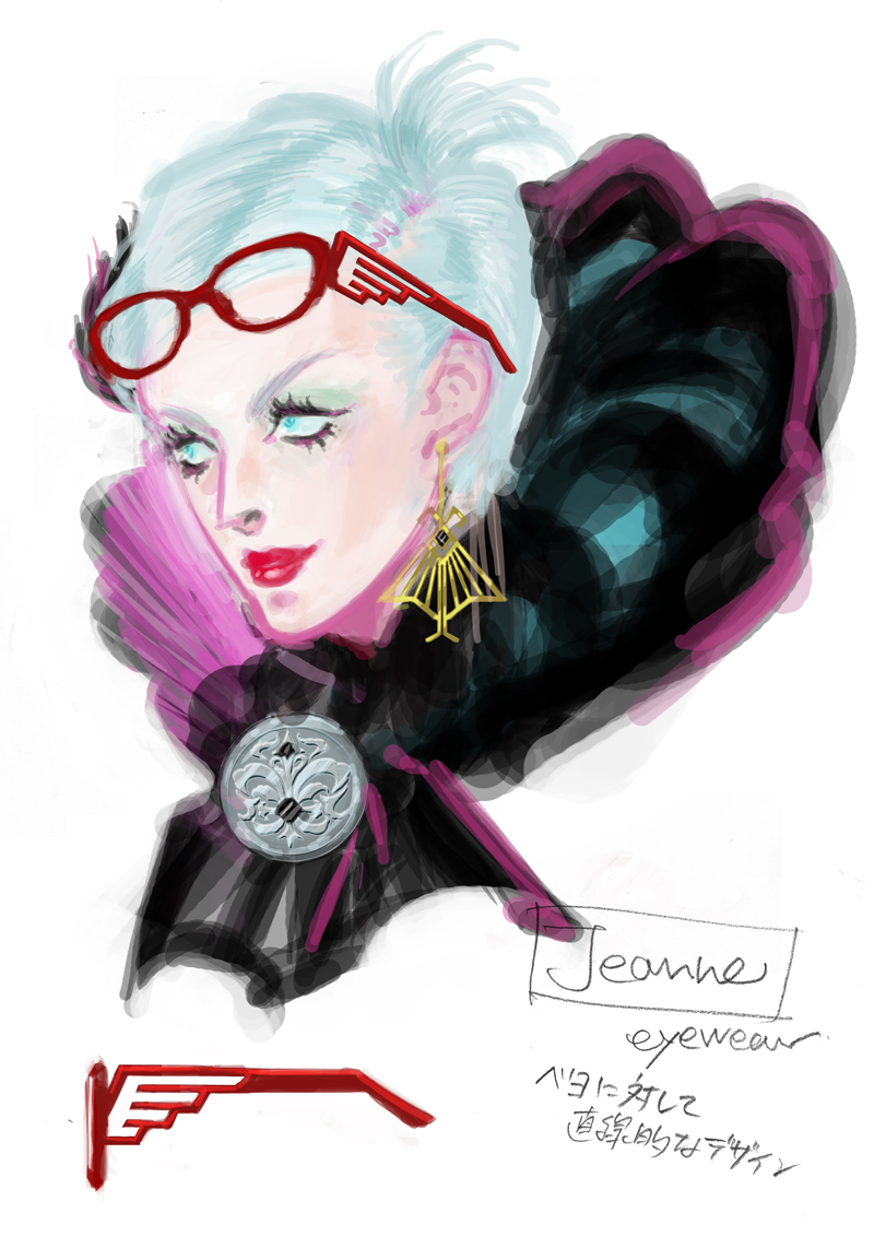
I wanted to make Jeanne feel like something out of the 1960s, so she wears rather thick makeup. Her blood red lips and lower eyelashes are the key points to this design. She actually wore her glasses at first; however, I felt it was a bit strange, so I decided to put them on her head instead. While Bayonetta is straight-forward and strong, I designed Jeanne to be a bit of a change-up if you will, with a sense that she is haughty and putting on airs.
To be honest, Jeanne’s design didn’t require a huge amount of effort, so there aren’t any particular incidents that happened during her design to revisit here…
Nevertheless, there you have it, our two witches. Checking around with the team, it seems that Jeanne is overwhelmingly the more popular of the pair. Kamiya-san is also extraordinarily attached to Jeanne. (He even told me exactly what her bust, waist, and hip measurements were.) But to be honest, I personally prefer Bayonetta…
Which one do all of you prefer?
Next time, I hope to blog about designing the other characters in the game.
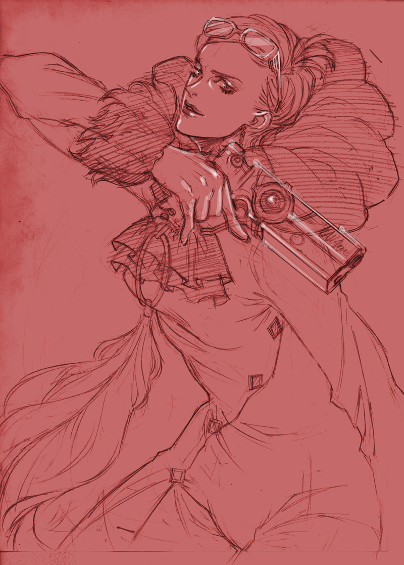
(NOTE: Higher resolution versions of the concept art in this post can be found on the PlatinumGames Inc. Flickr Page)